Colour Psychology: The Power of Red in Branding
Red is everywhere, and one of the only colours that symbolises paradoxical associations such as love, war, danger, passion and fame. The psychology of the colour red is known to evoke strong emotions, grab attention, increase heart rate and convey a sense of urgency or excitement, making it a valuable tool in creating unforgettable visual identities.
The colour psychology of red varies drastically, and this holds true in the way it is used in marketing and branding. What brand comes to mind when you think of the colour red? Maybe McDonald’s, or Netflix—or perhaps your mind goes to the more premium brands such as Ferrari or Louboutin. Whatever it may be, all these brands have one thing in common—they stand out among the rest.
McDonalds
ELICITED FEELING: COMFORT
Also known as the ‘Golden Arches’ and the fast-food company that paved the way for hundreds of others who came after. Founded in 1940, they were the fast-food innovators. Today, they are the biggest fast-food chain in the world.
As kids, it was the best day when we were treated with a Happy Meal. Now as adults, when we treat ourselves to a Big Mac or Quarter Pounder, it brings us the same joy and comfort (minus the added guilt we feel after).
McDonalds definitely understood the colour psychology of red. According to Karen Haller, an expert in behavioural colour and design psychology, she says “red triggers stimulation, appetite, hunger; it attracts attention.” So when you’re on a road trip and see McDonalds in your peripherals, and suddenly feel hungry, now you know why.

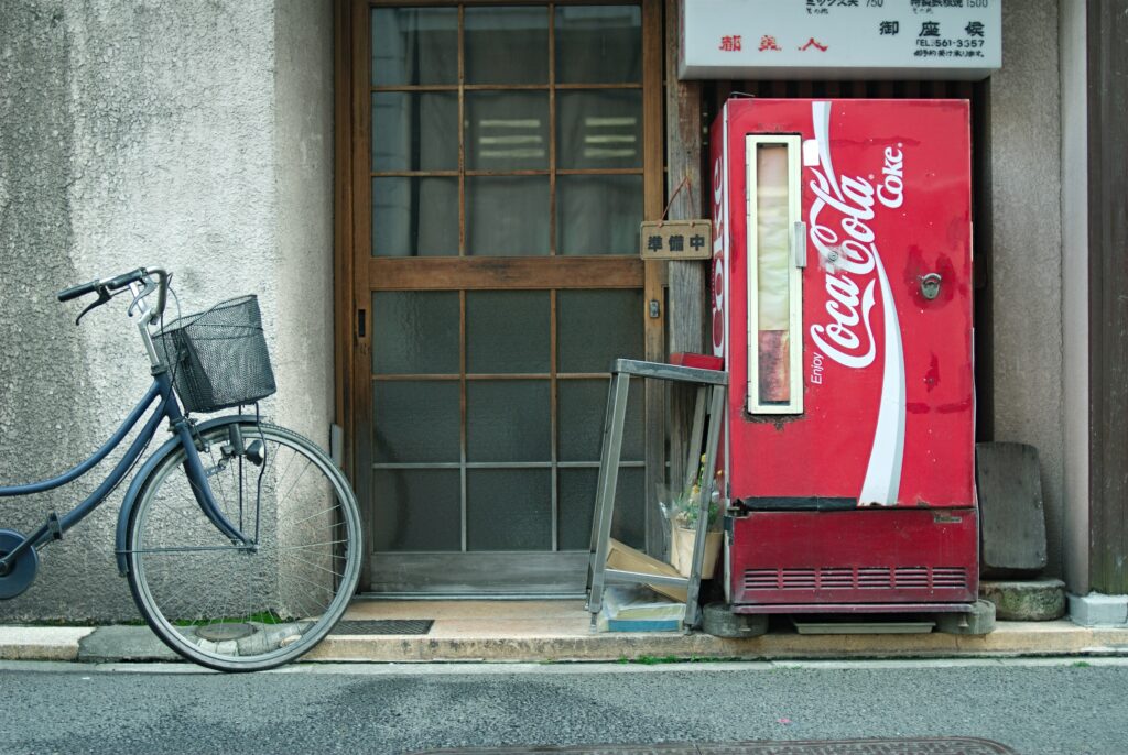
Coca-Cola
ELICITED FEELING: NOSTALGIA
No matter who you are, you can’t deny the joy that comes from opening an ice-cold can of Coca-Cola—we’re practically salivating just thinking about it. A beverage that has been enjoyed by the rich and poor for decades. That first sip is the taste of nostalgia. It’s the birthday parties in the backyard, the piping hot beach days, the go-to after a long day at the office and the perfect pair with anything salty.
The story of why they chose red is slightly different and unintentional than the others. Years ago, alcohol and Coca-Cola were both sold in barrels, and since alcohol was heavily taxed, they needed a way to differentiate the two. So they decided to ship the heavenly liquid in red barrels to avoid confusion. So whether they were aware of the physiological effects red has on consumers or not, the iconic colour has become a lasting symbol of joy and nostalgia.
And suddenly, we feel like an iced cold can of Coke, anyone else?
Red Bull
ELICITED FEELING: FEARLESSNESS
If you’re looking for wiiings, you likely know where to find them. Whether you’re a fan of the product or not, I think we can all appreciate the stellar execution of this brand.
Red Bull has strategically associated its brand with extreme sports, and it’s been remarkably successful. The colour red prominent in their logo and branding, plays a crucial role in this strategy. Red is often associated with energy and courage, qualities that perfectly align with extreme sports athletes.
They’ve practically embraced every sport known to man, and have even revived the classic Soap Box Derby race from “The Little Rascals,” where participants build their own unique prototype vehicles (our personal favourite event).
Ferrari
ELICITED FEELING: ACCOMPLISHMENT
We’ve all glimpsed a person driving a Ferrari and thought, “I wonder what they do for a living”. We automatically assume that this person is accomplished (and obviously cool).
The energy and passion of Italy’s iconic luxury car is best represented by the colour red. Ferrari has elevated red to symbolize Italy’s fiery passion for sports and indulgence. The logo featuring the stallion against the backdrop of ‘Rosso Corsa’ (which translates to “racing red”), a deep red, increases the heartbeat of spectators and especially, the drivers.
As Enzo Ferrari once said, “Everyone dreams of driving a Ferrari, it was my intention from the start.”
Budweiser
ELICITED FEELING: PATRIOTISM
Are you even American if you don’t drink Budweiser? ‘The King of Beers’ has established itself as THE beer to drink if you’re a true patriot.
Budweiser has undergone many logo changes over the years, but one thing that has remained consistent throughout is the colour red. Today, their logo consists of a vibrant shade of red that symbolizes power, passion and strength, resonating deeply with themes of patriotism.
Csek Creative
ELICITED FEELING: EXCITEMENT
This marketing agency has earned a reputation for liberating brands in their community since 1999. Giving a side eye to the norm, Csek Creative always brings a fresh and innovative approach to every project.
They recently rebranded with the tagline “The House of More” which represents the ability to deliver more than what is expected of them. The new logo with an eye-catching red, symbolizes the excitement and passion that you can feel in the work they produce.
While they may reside under one roof, their ambitions are not limited by their height. Like they always say, “By choosing Csek, you’re choosing more for your brand”.
Is red your colour?
Red has many meanings, but one thing is clear across all brands; it ensures they stand out. Bold and attention-grabbing, choosing red sets high expectations. It signifies passion, energy, and often a daring spirit that commands attention in a crowded marketplace.
As a marketing agency, we understand the power of colour in branding.